Plot Parallel Analysis Scree Plot
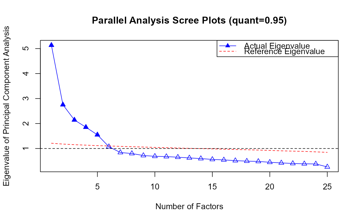
plot.PA.RdThis function creates a Parallel Analysis (PA) scree plot to compare the eigenvalues of the actual data with the eigenvalues from simulated data. The plot helps in determining the number of factors by visualizing where the eigenvalues of the actual data intersect with those from simulated data. It provides a graphical representation of the results from a parallel analysis to aid in factor selection.
# S3 method for class 'PA'
plot(x, ...)
Arguments
Value
None. This function is used for side effects (plotting).
See also
Examples
library(EFAfactors)
set.seed(123)

##Take the data.bfi dataset as an example.
data(data.bfi)

response <- as.matrix(data.bfi[, 1:25]) ## loading data
response <- na.omit(response) ## Remove samples with NA/missing values

## Transform the scores of reverse-scored items to normal scoring
response[, c(1, 9, 10, 11, 12, 22, 25)] <- 6 - response[, c(1, 9, 10, 11, 12, 22, 25)] + 1

# \donttest{
 PA.obj <- PA(response)
#> The number of factors suggested by PA  (quant=0.95)  is 5 .


 ## PA plot
 plot(PA.obj)

# }